Humanitarian High Resolution Mapping
Complementing Assessments with Remote Sensing Open Data
4.2 Features extraction from open sources
4.2.1.1 Training the CNN on nightlights data
5.2.1 Open Source and Productionisation
5.2.2 Better Proxy for Poverty
Being able to monitor the food security situation is a crucial condition for reducing hunger. For this reason, the World Food Programme (WFP) is continuously conducting household surveys. However, the difficulties and cost of collecting face-to-face data in remote or unsafe areas mean that the estimates are only representative at a low resolution - usually regional or district level aggregation. In order to allocate resources more efficiently, WFP and other humanitarian actors need more detailed maps.
The main aim of our initiative is to leverage open geospatial data for use in WFP and other humanitarian sector assessments and to make it accessible for a broad range of users. In WFP’s context this means enabling users to produce fine-scale food security maps.
Our approach builds on recent findings by a research group from Stanford on how machine learning and high-resolution satellite images can be used in combination with survey data to predict poverty indicators for small areas (Head, Manguin, Tran, & Blumenstock, 2017; Jean et al., 2016). We tested our approach for a variety of country case studies based on World Bank as well as World Food Programme survey data.
The results contribute to the existing literature with regards to three main points: First, by combining further valuable open-source data, such as OpenStreetMap information and nightlights, with the satellite data-based image recognition, and weighting it by population data, we are able to further refine prediction results for poverty indicators. Second, by applying the model to food security indicators, we broaden the usage of high-resolution mapping to humanitarian actors. Third, we increase the operationalization of research results by making results easily accessible to policy makers through a web-based application.
2 Existing Literature on High Spatial Resolution Mapping
Different approaches have been used to map socio-economic indicators at a high spatial resolution. These approaches generally rely on survey data as ground truth to estimate and evaluate statistical models and they mostly focus on poverty indicators. However, the set of covariates and the techniques employed to extract these covariates vary broadly.
The most common statistical technique is referred to as Small Area Estimates (SAE, Elbers, Lanjouw, & Lanjouw, 2003). It consists in fitting a model linking the target variable of interest with a set of relevant covariates collected through survey data and applying this model to the same set of covariates in census data (where the target variable was not measured). Census population counts usually being available at a very small administrative level, the resulting predictions downscale the results. WFP, for example, produced small-area estimations of food security indicators in Bangladesh (Jones and Haslett, 2003), Nepal (Jones and Haslett, 2006 and 2013) and Cambodia (Haslett, Jones and Sefton, 2013). This technique, however is difficult to apply in Sub-Saharan Africa as it requires recent and reliable census data. It also relies on the assumption that the set of covariates was measured in the same way in both the survey and the census data.
Where no census data was available, researchers have been using geospatial data to make predictions at a high spatial resolution. Geospatial data is gridded data of diverse covariates, such as climate, accessibility, environment or topographic features. These gridded covariates are often derived from satellite imagery and are, therefore, available globally at a high resolution. WorldPop researchers have found that these geospatial covariates are able to predict the geographic distribution of population and population characteristics (age, births, etc.) well. In particular, models trained on census population counts were able to map population distribution at 100m resolution in the majority of countries in the world (Alegana et al., 2015; Tatem, 2014).
Geospatial data has also been used to model gender-disaggregated development indicators in four African countries as well as poverty indicators in a variety of countries. The ground truth data comes from the Demographic and Health Surveys Program (DHS) and the World Bank’s Living Standards Measurement Study (LSMS). Their assessments are linked to geographic covariates with the survey GPS coordinates available at the cluster level. This method is referred as the Bottom-Up approach. In a study in Bangladesh, Steele et al. (2017) also used mobile-phone metadata features available at the cell-phone tower level were also used as additional covariates to predict poverty.
Finally, a group at Stanford University (Jean et al., 2016) has used image recognition machine learning models to extract features from high-resolution satellite images. They predicted poverty indicators (wealth index and expenditures) in five African countries with the extracted features. This technique known as Transfer Learning is complex: Convolutional Neural Networks are trained to classify nightlight intensity from the satellite images and features are extracted from the intermediate layers of the trained networks. Those features are then fed into a traditional linear model. The ground truth data is also LSMS and DHS data aggregated at the survey cluster location. This approach has since been replicated with a broader set of indicators and countries (Head, Manguin, Tran, & Blumenstock, 2017) .
The main aim of this paper is to contribute to the existing research by trying to unify the different approaches in an attempt to create an automatic process that would apply on various food security indicators collected by WFP. We have selected data sources that are globally and programmatically available and built a pipeline to process data and extract covariates. More specifically, we have innovated the current approaches by:
Humanitarian High Resolution Mapping is about developing an application which automatically draws on various open data sources/streams combined with survey data to produce detailed maps of poverty and food security. Machine learning is used to optimize the models that describe the relationships between the survey indicators and the various features we extract from the open data sources are. Once the models are trained, we use them to make predictions for areas where no survey data was collected (out-of-sample predictions) and to visualize those predictions in maps.
To date, we have deployed a first version of a simple web application for internal testing that is able to automatically downscale geo-referenced survey data. Geographic coordinates are increasingly being recorded when household surveys are conducted and this application enables users to easily upload geo-referenced survey data and make predictions for areas where no survey data is available. It produces a raster that can then be re-aggregated to a given administrative level. Once the data is uploaded, the system automatically pulls covariate data that is relevant to the area and time of interest from:
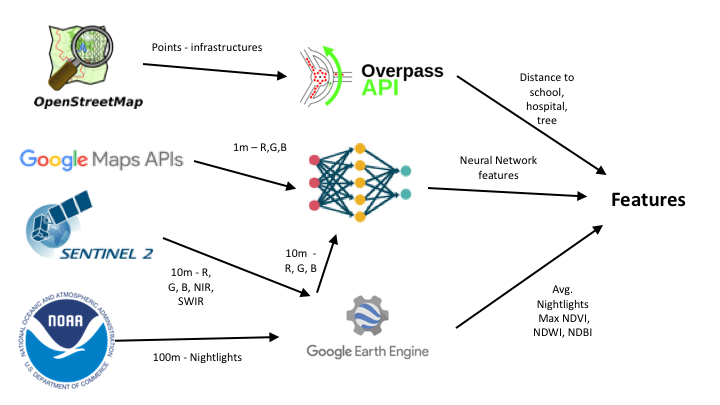
Our method is described in Section 3 and the individual sources are described in greater detail in Section 4. The graph below gives an overview of the interaction between the different sources.
3 Method
1. Feature extraction from open data sources: Several features, such as nightlight intensity or distance to schools, are extracted from the open data sources for each location that has been surveyed. All of the features are used as covariates in a regularized linear model (Ridge Regression) to make predictions.
2. Geo-referenced survey data: In order to take into account the spatial relationships in the survey data (a food-insecure household is more likely to be close to other food-insecure households rather than in the middle of a wealthy population), we separately run a k-Nearest Neighbor algorithm on the GPS coordinates. With some datasets, this interpolation technique actually leads to better results than the regression that is trained on the extracted features (when other data sources are excluded). Our results showed that more sophisticated interpolation techniques such as Kriging do not always lead to better results.
To receive the most detailed results, the predictions from both models (the Ridge regression and the k-NN) are averaged in the final model.
Prediction models will be strongly biased if they do not take into account population density.We therefore only score inhabited areas where the filtering is done using WorldPop’s population densities rasters [4]. Having tested different providers, we found WorldPop to be the most accurate source for detecting settlements.
To test the validity of our models, we evaluate them on unseen data and report the coefficient of determination (R2). The cross-validated R2 scores are averaged from 20 different five-fold cross-validation loops to get more reliable results. In each fold, we also run nested cross-validation to tune the regularization (alpha) parameter of the Ridge regression and the number of neighbours (k) in the k-NN regression.
The prototype is built in python and open-source libraries. The code is publicly available on GitHub and more complex algorithms can easily be integrated.
To test our approach, we have used household-level survey data from three different types of data-sets which each collect data on different indicators. We tested our models for both general poverty and food security indicators, as available in the data:
In order to provide a reliable estimate of the indicator at the community level, data was aggregated to the lowest community level available, the cluster-level. In WB and DHS data, geolocation is available at the cluster level, but set off (up to 10km) for data privacy reasons. In the WFP data, we have access to household-level GPS coordinates. The interviews for most of the recent surveys have been conducted using tablets that automatically report the coordinates of each interview. These locations are aggregated at the cluster (enumeration area) level. When the cluster variable is not available, a clustering on geo-location is performed. Clusters with less than three households are discarded to reduce the influence of possible outliers. The number of households per cluster varies from one assessment to another but is in most cases between 10 and 30.
Indicators are aggregated on cluster-level as mean (FCS, wealth index) or median (expenditures), depending on the existence of outliers. Total and food expenditures are continuous variables, with food expenditures being one component of total expenditures. Comparison between WFP and WB expenditures indicators is difficult due to a shorter survey module in WFP surveys. The wealth index is a composite measure of a household’s living standard. It is constructed using Principal Component Analysis (PCA) of information about asset ownership. The Food Consumption Score (FCS) is one of WFPs corporate proxy indicator for household food security. It measures dietary diversity and meals frequency.
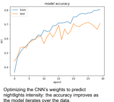
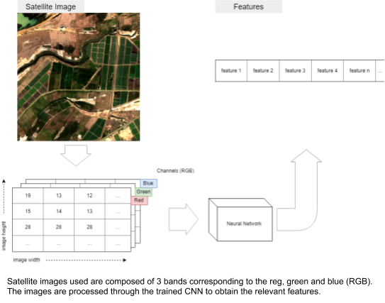
One of the data sources used in the pipeline are RGB images for the AOI from Sentinel 2 and Google Maps. The processing here is inspired by the transfer learning approach developed by Neal et al. [2]: convolutional neural networks (CNNs) are trained to predict nightlight intensities (as a proxy of poverty) from satellite imagery and later used to extract features to be used as covariates in the same pipeline mentioned above. In our pipeline we train two models respectively: One for Google images and one for Sentinel images.
The nightlights data is obtained from the same source as described below in the Section 4.5 and then binned into three categories according to their luminosity: low, medium and high. These values become the labels for training our models. The nightlights data from the following countries has been used so far to train the model: Senegal, Nigeria, Uganda and Malawi. The nightlights are masked with ESA’s land use product to take luminosity only from populated areas in order to reduce class imbalance. Google and Sentinel images are then downloaded.
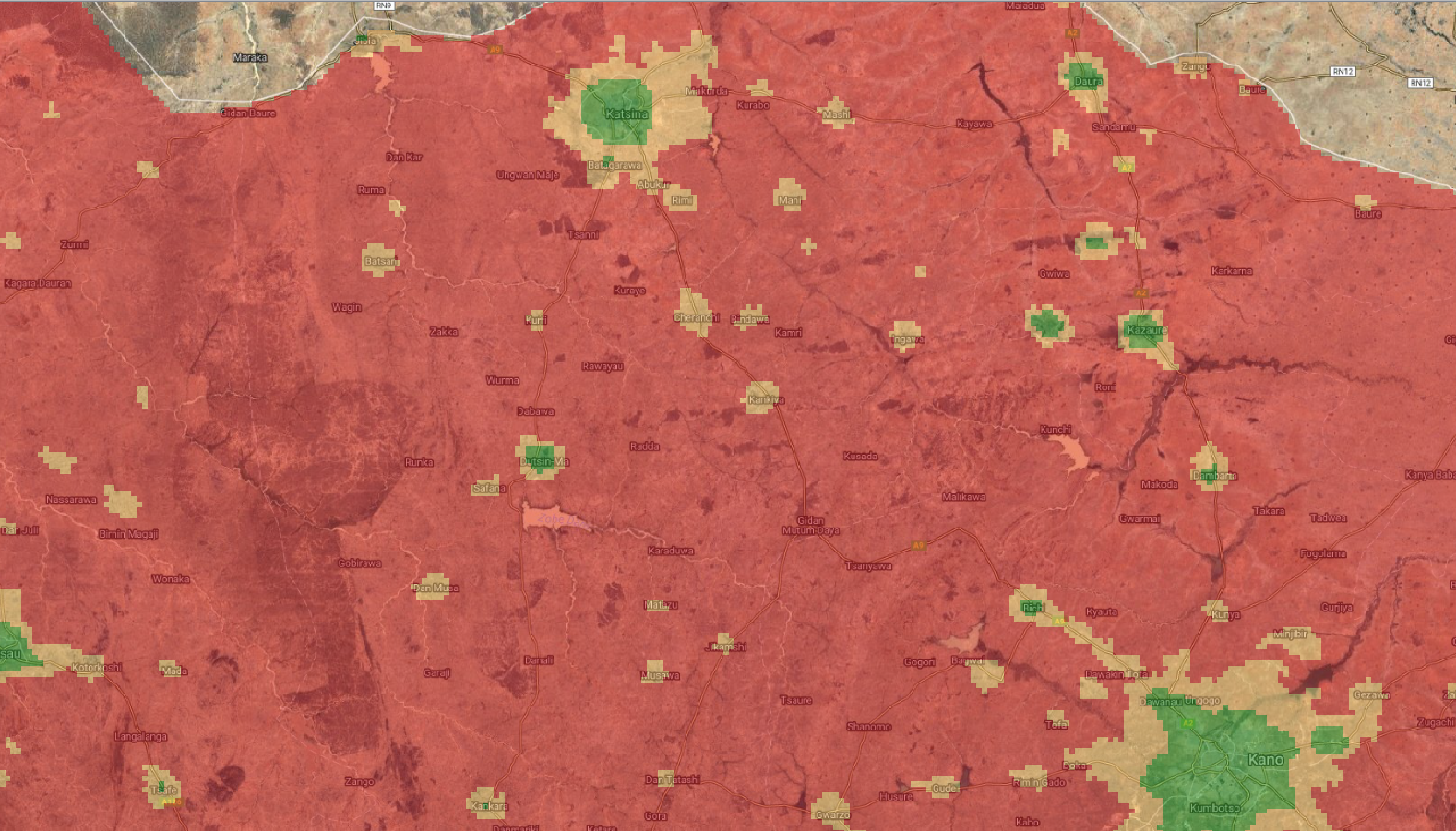
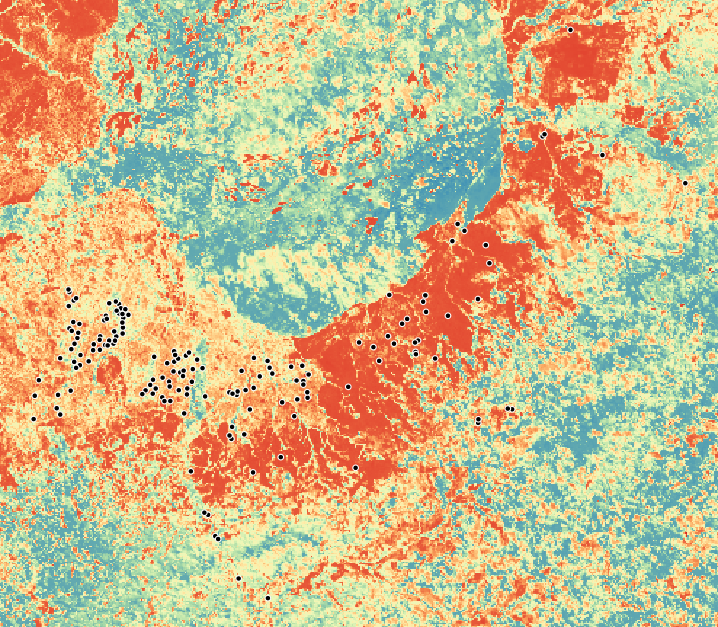
Fig X Nightlights binned as low (reg), medium (yellow) and high (green) in northern Nigeria.
The images and the nightlights classes are fed to convolutional neural networks. Compared to the transfer learning approaches mentioned above, our method uses a much smaller model architecture for two reasons: firstly, because we used fewer images and secondly, because we wanted a light model that would be able to score images fast. The final accuracy on validation sets ranges from 60% to 70%. The code for this component including the network’s architecture can be found here.
The trained models are then used to extract features from the satellite images relevant to the cluster that needs to be/has been surveyed. In this configuration we remove the last layer of the network that is used to predict the three classes and average the outputs resulting in 256 features per image per satellite. Dimensionality reduction (PCA) is applied to these features to obtain ten features per image per satellite. The class that handles this work in the code is the nn_extractor.
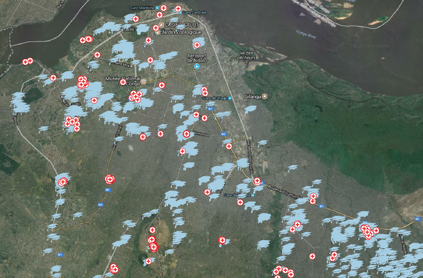
Fig X Schools and hospitals tagged in Open Street Map in parts of Kinshasa.
Open Street Map (OSM) is often the most accurate source of data on infrastructure in developing countries. All the data can be easily accessed and downloaded through the OverPass API.
We currently extract the location of schools and hospitals in the AOI from Open Street Map and compute the distance of the AOI to the closest school and hospital. Other infrastructure locations could be extracted such as parks, roads, and trees. However, the completeness of these layers varies a lot from country to country and even within the same country. We found that schools and hospitals have been the features most thoroughly mapped by OSM volunteers across our countries of interest.
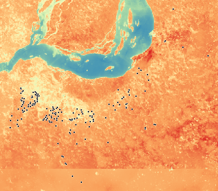
Fig X max NDVI, NDWI and NDBI extarcted from Sentinel 2 in Kinshasa .
Sentinel-2 is an Earth observation mission of the European Space Agency (ESA) launched in 2015. Multi-spectral images of the earth are available every five days at a resolution of ten metres. We use the Google Earth Engine platform to access and compute indices on these imageries. Currently, we extract three indices from four spectral bands (green, red, near infrared and shortwave infrared bands) at a given x, y location:
We compute the maximum values for NDVI, NDWI and NDBI in a twelve-month period corresponding to the year of data collection. We then average the indexes spatially in a 1 kilometre x 1 kilometre buffer around the point of interest. As the Sentinel-2 data only started to be available in late 2015, if the survey data was collected before this date, we take the 2016 indices instead.
Taking the maximum value over a year gives us a greater chance of extracting these indices in images without clouds. For the vegetation index, this technique also allows us to have a picture of the state of the crops at the peak of the growing season. More research needs to be done on extracting seasonality NDVI indices that reflect the difference between the growing seasons and the rest of the agricultural calendar or compare the survey year with the previous years to detect a bad or good growing season that could partially explain the food security status.
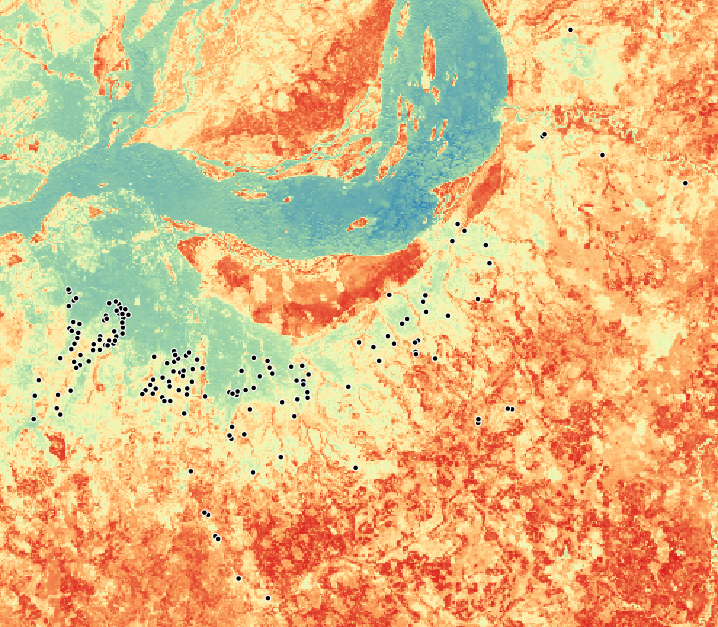
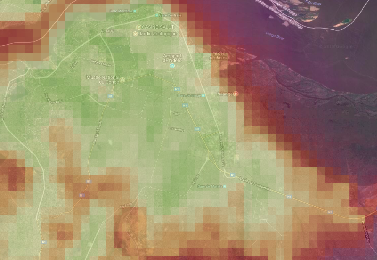
Fig X Luminosity over Kinshasa in 2017.
Nightlights are highly correlated with poverty (Neal, J.) and from our experience, to some extent with food security. For each AOI and relevant period, we derive the luminosity from the National Oceanic and Atmospheric Administration (NOAA) of the US Department of Commerce. In particular we use the NOAA Visible Infrared Imaging Radiometer Suite (VIIRS) monthly product, normalized by the DMSP-OLS Nighttime Lights Time Series, also from NOAA. The result is a georeferenced dataset with the luminosity shown on a 100 metre x 100 metre grid. Each surveyed cluster is then assigned an average luminosity from the area around its location. The core of the code that handles this data source is the nightlights class.
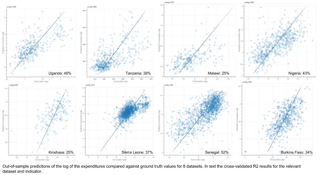
Our results on the chosen poverty and food security indicators are promising. We are using the R2 as the evaluation metric because it gives us a sense of the performance of the model against the mean. The datasets we have used to test the method are from a variety of countries in Africa and were collected by a number of organisations. The two main sources are described in Section 4.1: LSMS surveys from the World Bank and the World Food Programme’s main survey, the Enquête Nationale de la Sécurité Alimentaire (ENSA) as well as the Comprehensive Food Security and Vulnerability Analysis (CFSVA). The model was also tested on data from one WFP urban food security assessment. From all surveys we used expenditures as the proxy indicator for poverty as well as one proxy indicator for food security (food expenditures or FCS, depending on availability.). The table below presents the results for the principal datasets that we have been evaluating the model on:
Survey Type | AOI | Clusters | Year | Indicator | R2 |
LSMS | Nigeria | 408 | 2012 | Expenditures (log) | 0.42 |
Malawi | 205 | 2013 | Expenditures (log) | 0.25 | |
Food Expenditures (log) | 0.18 | ||||
Tanzania | 409 | 2012 | Expenditures (log) | 0.38 | |
Food Expenditures (log) | 0.34 | ||||
Uganda | 641 | 2013 | Expenditures (log) | 0.46 | |
CFSVA | Sierra Leone | 1292 | 2015 | Expenditures (log) | 0.37 |
Food Consumption Score | 0.24 | ||||
URBAN | Kinshasa | 159 | 2017 | Expenditures (log) | 0.25 |
Food Consumption Score | 0.18 | ||||
CFSVA | Senegal | 1207 | 2013 | Expenditures (log) | 0.27 |
Food Consumption Score | 0.52 | ||||
Burkina Faso | 567 | 2018 | Expenditures (log) | 0.12 | |
Food Consumption Score | 0.34 |
For food security indicators, namely food expenditures in World Bank and Food Consumption Score in WFP datasets, results are generally some percentage points lower than for expenditures in the respective country. An exception can be observed in Senegal and Burkina Faso (both WFP data), where the R2 for FCS is higher than the one for expenditures, reaching the best result of all predictions with 52% in Senegal.
When interpreting these results, we need to take into account the different quality of indicators in LSMS and WFP datasets. While LSMS surveys have a strong focus on expenditures and use a very detailed module, WFP surveys are shorter and less detailed and precise in terms of expenditures. On the other hand, the indicator on food security in WFP surveys, FCS, is better suited to actually measuring food access through food diversity and quality than the LSMS indicator of food expenditures. With regards to this trade-off, the results from Senegal and Burkina Faso in particular show the potential that our method offers for predicting food security indicators at a high resolution. To verify the potential, we are currently testing the model on further data sets taking into account the different contexts of those countries.
We have found survey data to be a challenging aspect of this project. Processing and preparing survey data is very time-consuming as datasets differ in nomenclature and methods. Furthermore, to this date, geographic locations of the surveys have hardly been recorded accurately, if at all, and sometimes are not made public due to the sensitivity of the data. The study is therefore limited to only a few available recent datasets.
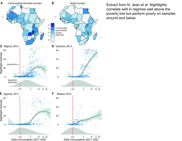
The data sources used in this application are chosen for their accessibility independently of the dataset. This makes the method scalable as all sources can be accessed programmatically, just based on geo locations. However, depending on the dataset we are processing, different sources may be more or less useful to the model: some cities and regions in OpenStreetMap for example are very well tagged (for example Kinshasa), however entire other countries may be lacking satisfactory tagging (for example Burkina Faso). Similarly, the nightlight intensities, as previously shown by [2], correlate well with poverty in better-off areas but are almost non-existent in many areas that are the focus of WFP’s work (such as central Africa).
We want this solution or parts of it (for example modules dedicated to extracting OSM features) to be easily usable, by us and the wider community. The codebase is already public, however, we will invest time into refactoring the code, improving and documenting the method and making deployment easier.
At the moment, there are a few bottlenecks that slow down the application. The process that takes longest is the downloading and processing of Sentinel images because of their size (much larger than Google Maps). We have already moved most of the code that concerns Sentinel data to the Google Earth Engine API because we find this access point more convenient than the one provided by SentinelHUB. However, with ~1 second per image, the system is still too slow when processing large datasets.
Replacing nightlights with another proxy (maybe Call Detail Records?) to train the nets might improve our predictions.
Alegana, V. A., Atkinson, P. M., Pezzulo, C., Sorichetta, A., Weiss, D., Bird, T., … Tatem, A. J. (2015). Fine resolution mapping of population age-structures for health and development applications. Journal of The Royal Society Interface, 12(105). https://doi.org/10.1098/rsif.2015.0073
Elbers, C., Lanjouw, J. O., & Lanjouw, P. (2003). Micro-Level Estimation of Poverty and Inequality. Econometrica, 71(1), 355–364. https://doi.org/10.1111/1468-0262.00399
Giorgi, E. & Diggle, P (2016). Model-Based Geostatistics for Prevalence Mapping in Low-Resource Settings. Journal of the American Statistical Association, 111:515, 1096-1120, https://doi.org/10.1080/01621459.2015.1123158
Head, A., Manguin, M., Tran, N., & Blumenstock, J. E. (2017). Can Human Development be Measured with Satellite Imagery? (pp. 1–11). ACM Press. https://doi.org/10.1145/3136560.3136576
Jean, N., Burke, M., Xie, M., Davis, W. M., Lobell, D. B., & Ermon, S. (2016). Combining satellite imagery and machine learning to predict poverty. Science, 353(6301), 790. https://doi.org/10.1126/science.aaf7894
Steele, J. E., Sundsøy, P. R., Pezzulo, C., Alegana, V. A., Bird, T. J., Blumenstock, J., … Bengtsson, L. (2017). Mapping poverty using mobile phone and satellite data. Journal of the Royal Society, Interface, 14(127). https://doi.org/10.1098/rsif.2016.0690
Tatem, A. J. (2014). Mapping the denominator: spatial demography in the measurement of progress. International Health, 6(3), 153–155. https://doi.org/10.1093/inthealth/ihu057
Wardrop, N. A., Jochem, W. C., Bird, T. J., Chamberlain, H. R., Clarke, D., Kerr, D., … Tatem, A. J. (2018). Spatially disaggregated population estimates in the absence of national population and housing census data. Proceedings of the National Academy of Sciences, 115(14), 3529. https://doi.org/10.1073/pnas.1715305115